The new Museo del Novecento (20th century art) in Milan opened December 6 2010 and admission was free until February 28 2011. The combination free + new museum made me take a trip to Milan to check it out. I brought my most critical eye with the intention of writing a useful review for anyone interested in visiting this museum, or for readers who are curious about the latest museology in Italy.
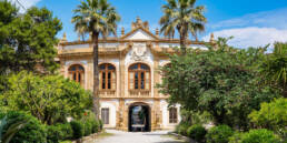
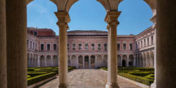
The Novecento museum must have been a major architectural challenge for Italo Rota and his team, since it involved the restoration and adaptation of existing structures — in Piazza Duomo’s Palazzo dell’Arengario and the Palazzo Reale next door — to house Milan’s civic collections of modern art. As we move through these spaces we see the architecture evolve in connection with its contents, from Giuseppe Pellizza da Volpedo’s 1898 “Quarto Stato” (in its own niche off the central ramp, see photo) to Michelangelo Pistoletto’s Arte Povera. The museum path (percorso museale) was studied and developed by an impressive scientific committee comprising Massimo Accarisi (Direttore Centrale Cultura), Claudio Salsi (Direttore Settore Musei del Comune di Milano), Marina Pugliese (Direttore del Progetto Museo del Novecento) and advised by professors and museum directors from around Italy and England.

With the latest studies and technology available to them, you’d think that this star-studded team would take advantage of an opportunity to develop the perfect museum in which users would easily move through the space while experiencing a personal and educational path of growth thanks to discreetly presented information. Rather, the Museo del Novecento is a useful example of things not to do if you’re designing a new museum. This is not to say that it is all bad – I do like the aesthetics of some of the spaces and think that some parts of the collection are very interesting. But certain elements of museum design are very important to me (and probably to most museum-goers, even if they’re not completely conscious of them), and when these are not properly treated, the overall potential of the museum is greatly diminished. Below is my analysis of this museum’s flow, signage, and use of technology.
Crowd control and flow
The Museo del Novecento is experiencing unprecedented interest, in part probably because it is free at the moment. There have been long lines to get in ever since its opening in December. But as this is a city that frequently sees lines of half an hour or more to get into blockbuster exhibits like Miro (just closed), organizers might have predicted these crowds, or at least adapted to them with time.

In its location in what has been called Piazza Duomo’s B-side, the Palazzo dell’Arengario sits between the Duomo itself and the courtyard in front of Palazzo Reale. A line forms that blocks direct access to Palazzo Reale. Surprisingly, Italians have chosen to line up along a strip that is defined by a pattern in the pavement. But as I waited for just over one hour outside the museum (thankfully not in that city’s interminable rain), I had plenty of time to think about how they might have entertained me, educated me, or at least informed me while I waited. It seems minimal to ask that they might put out cords to create a line that loops back upon itself (like at an airport), with signs indicating how long the wait is from that point. But waiting is also a time that could be taken as an opportunity, upon which I shall reflect on my museum marketing blog.

We entered the museum already tired and obtuse, picked up a map/pamphlet from an information desk (why not hand those out as we walked in, or while we waited?) and headed in the only possible direction – up the circular ramp. This ramp is very pretty, with greenish blue floors, black barriers, and a white underside, with the path clearly signaled by small white LED lights embedded in the ground. Areas of intersection and the presence of emergency devices are indicated by red or green lights. Larger passages, such as those into individual galleries, are indicated with very bright lights in the doorway that I find more threatening than useful (I wonder if they’re x-raying me). Other passageways are black and indicated with oddly out-of-place clocks. I felt like Alice in Wonderland.
The layout of this museum is complex. And it takes a degree in architecture or engineering to understand the exploded map provided for its navigation. Luckily I had my husband, an engineer, to read it for me and to help us navigate through the spaces to the areas that most interested us. As is, we still almost missed the two sections that we liked best. This is in part because we were put off by the extreme crowds at the two mezzanine levels which comprise monographic rooms dedicated to De Chirico and another artist. An escalator leads you up to each of these rooms; you move through the small room to the other side, expecting a further escalator that will go, once again, UP. Rather, at the other side is the escalator DOWN, so to continue through the museum path, you have to go back through the room. And through the crowd.
Moving through the spaces of this museum is kind of like a treasure hunt, with a competitive crowd-pushing factor inserted. At capacity thanks to the long line outside, the artworks are at risk of damage. There is no bleeping alarm system to stop you from getting close to works, which is nice, but they really ought to be protected from massive crowds by a distancing device such as a soft-angled, unobtusive base.
Signage
Signage in museum display is the topic of extensive studies and reflections. What is the perfect place to put signs? What is the right amount of text? How large should font be? What is the perfect balance between information and invasion? I have something to say both about the signs (indications on walls) and labels (indications relative to single works of art).

Sometimes, one can apply objective values to the signage inside a museum. The labels for single works at the Museo del Novecento are placed too low. Sure, being at knee-height might be useful for wheelchair patrons, children, or the chronically growth-impaired, but the rest of us have to break our backs and squint to read them. As my back had already pretty much seized up during the one-hour wait outside, I was not in the mood to bend down with crowds of other patrons to read these labels. As a result, I have pretty much no idea what I was looking at.
Here is another objective value: Consistency. The information on labels is a kind of code. This is the artist. This is the title. This is the date, and here is some extra information (in some cases provided, in others not… hey you should know how important this work is without other information). There are symbols, such as the number to insert in an audioguide. There are symbols to indicate the provenance from one or another collection. Or wait… are there?
The logo of the Museo del Novecento is a stylized number 900 that, in all print material and online, is a shade of medium grey. So why is the 900 logo reproduced on the museum labels in a range of colours – blue, orange, green… Does this indicate the provenance from one of the multiple locations or donors that make up the collection? Quick, check the map/handout to find out… no information provided. (Later I found someone to ask; she told me it was entirely random (casuale). And another interesting aside – the logo and other choices are explained in a video with Brand Designer Massimo Pitis in which he says that in his vision, the museum is a space that is born with the architecture, that is closed, protected; at the same time it’s also an open space for exhibitions. But to me this is the wrong approach – shouldn’t the museum be first born of the works, not of the container? Isn’t the era of the archistar museum officially over?)
And one more objective value: Font size. Guy Kawasaki suggests that, when preparing a powerpoint talk, you calculate the average age of your audience and never use a font that is less than half that number. So, for an audience of retirees, your presentation should have a 30-35 point font size. For teenagers you can use 10 point arial. The same should apply to museum labels. If a 35-year-old wearing glasses cannot see your signs, they are written TOO SMALL!

The thematic room descriptions in the Museo del Novecento are placed at the doorway to each room (sometimes in the preceeding room, sometimes in the doorway, sometimes just after it). These are written in Italian, with English text below in italics. Other than the title of the room, the text is one block, undefined by bold or paragraph breaks. The font size is probably 18 point. Whatever it was, I could not read it. You have to get quite close to read this block of text, but if you do so, you are blocking the doorway. Politely standing to one side, you are too far away to read. So once again, I had no idea what I was looking at, nor why. And I suspect that it’s not just me.
Use of technology
The Museo del Novecento, being brand new, could take advantage of all sorts of new and not so new technologies to provide extra information about artworks as well as to encourage passive viewers to become active participants. In fact, it has chosen Bluetooth technology to push information (images and text) to your cell phone. This is a good, low-cost solution that is relatively democratic (much of the population has a bluetooth-enabled cell phone) and that does not require internet connection. Too bad it doesn’t work.
Having read how to use the bluetooth system on their website, in the museum’s first room I activated bluetooth on my smartphone and waited for the permission request from Arengario. I saw 7-8 other devices with personal names (indicating that others were trying to use this service), but Arengario or Museo del Novecento were not present. I figured it would be wise to ask museum staff for help.
In any institution, it is important to train one’s staff about the services offered within. This should be even more the case when you hire brand new staff for a brand new museum. I approached a 40-something female guard and asked her “Excuse me, could you tell me how does the bluetooth technology that I read about on your website work?”. She snarled: “The what? I don’t know.” I suggested that she should probably inform herself about this service offered by the museum, to which her response was “That is not my job.” Harried, I resolved to test 3-5 museum staff members with this and other questions.
Later, I found a smiling young woman guard who was explaining something about an artwork to another museum patron, so I asked her about the bluetooth. She said unfortunately it was not yet working, despite the fact that the place had been open for almost three months. As she seemed well informed, I asked her about another thing that had perplexed me – the colours on the signage mentioned above – and she responded knowledgeably. She probably is a new hire with a phd in art history.

For the moment, the museum does not seem to integrate any other kind of information or interaction technology into the visit. Traditional audioguide headsets are available (for a fee), as are guided tours. A section of the website dedicated to “podcasts” are not podcasts but video interviews (only in Italian). Too bad – it would be nice to be able to download a podcast to use in the museum for free. No other easy to produce technology is provided, like an iphone app (sure could be useful to geolocalize myself in that museum, I’d have been less lost) or online/mobile catalogue… nor a mobile website for that matter. Need we not point out that said museum is not present on any social media, so they will probably never read this review. Too bad.
Final thoughts
In conclusion, perhaps had the museum been almost empty I might have been able to better appreciate the discreet way that the architecture leads me through the history of 20th-century Italian art, and I might have taken the time to focus on that tiny text and learn this part that is essentially missing from my art history education. I doubt that this museum will ever be so empty. And even if it were, a large onus would be upon the viewer to find and read about (on an external device using wikipedia?) the works within. A new museum has the opportunity to provide new means by which visitors of all levels can reflect upon art, as well as to target new experiential viewers and young people. There is no denying that a lot of planning and thought has gone into this project, and that it is not easy to open a museum of this scale, but I feel that the Museo del Novecento does not provide these essential tools necessary to fulfill the museum’s stated mission: “To encourage, through work on various levels, an intercultural approach and involve a public that ranges from specialists to children and passing visitors.”
Photos
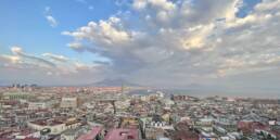
One good thing about this museum is that it appears permitted to take photos. As I wasn’t sure of this permission, at first my photos are taken “illegally from the hip”, so those from the first rooms are a bit odd. The photo gallery below takes you through the whole space from start to finish. Enjoy!